#JasperHero Jay Fletcher: The Artist Behind The Jasper’s Branding
The Jasper’s distinctive brand identity was designed by Charleston graphic designer Jay Fletcher. Jay is known well beyond Charleston for his compelling logo design and illustration. The Connecticut-native has been impacting Charleston brands since 2004, and his career has expanded internationally, working for brands like Apple, The New York Times, NFL, and Google.
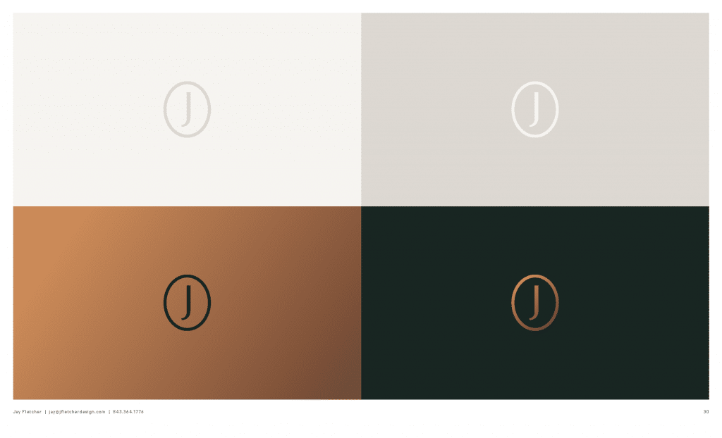
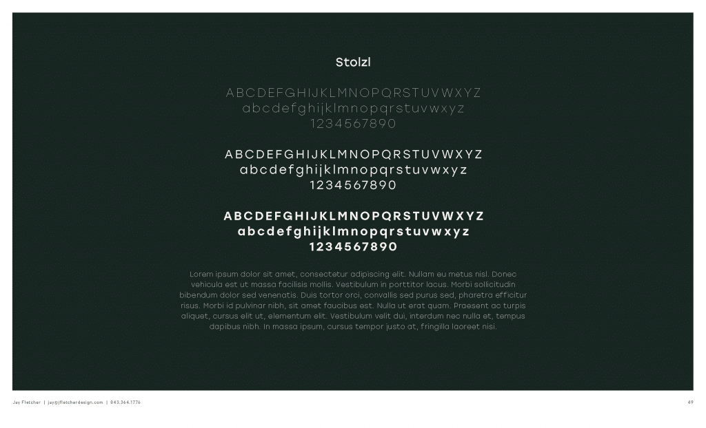
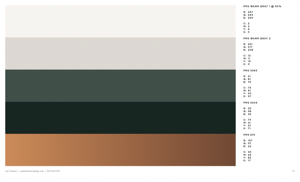
Rather than submit several individual concepts for The Jasper’s brand, Jay took a unique approach. Instead, he provided a “wardrobe” of graphic icons that all work together. The customized serif font and color palette of bronze and Charleston Green are key details from the logo and patterns that Jay created to represent the brand. Looking closely, each element was purposefully designed to reflect The Jasper’s story, luxurious experience, and Charleston’s history. The talented local artist used his design choices to intentionally embody the elegant architecture and nature of this Broad Street building.
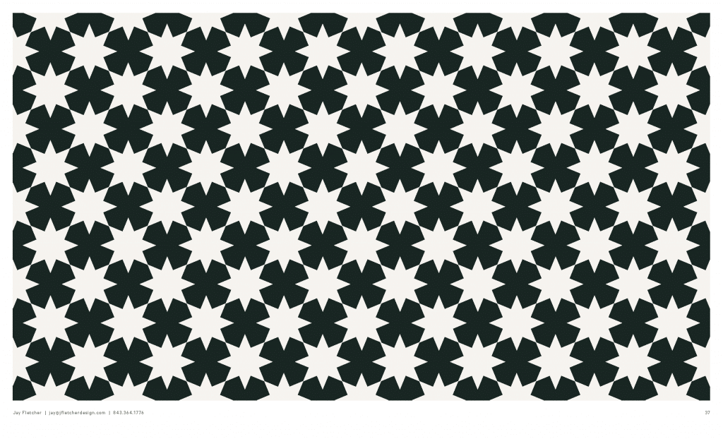
The star motif is a tribute to the Sergeant Jasper, the preceding residential building that existed on that corner of Broad Street. A large star of lights crowned the top of the building and was lit in conjunction with the Colonial Lake tree lighting for the celebration of the holiday season. This star became Sergeant Jasper’s most recognizable icon that many locals still remember the old residential building by. It was important to incorporate the star as it pays tribute to The Beach Company legacy project, which was built by the original founder of the company, J.C. Long. The star symbol can also be seen throughout other parts of the building such as the rooftop pool mosaic tiling.
The classic Charleston Green represents a historic story that is illustrated throughout the Holy City’s streets on countless building shutters and doors. The color became famous after the American Civil War, when buckets of plain black paint were sent by the government to cover up the damage from the war. Charlestonians responded to the dull gift by adding yellow and blue paint to create the iconic dark green. This hue quickly grew in popularity and can now be seen throughout the city. It became the clear choice for branding because of its timeless appeal and depiction of Charleston’s classic high-style and history.
The Jasper team was proud to work with Jay, his humble personality and creative energy made him an incredible partner on this project. His talent helped shape The Jasper’s unique visual branding for years to come.
